Preview Any Website on Desktop, Tablet & Mobile
Free responsive testing tools. Enter a URL and instantly see how any site looks across screen sizes — no sign-up required.
Try the Free Preview ToolTrue device widths
Each preview frame renders at a real viewport width — 1280px, 768px, and 375px — scaled to fit your screen.
Instant side-by-side results
Type any public URL and hit Preview. Desktop, tablet, and mobile views load together in seconds.
Free forever
No accounts, no limits, no watermarks. Just fast, honest website preview and testing tools.
What is PreviewYourSite?
PreviewYourSite is a free website preview and responsive testing tools site. It helps web developers, designers, and site owners check how any website looks on mobile, tablet, and desktop before publishing — no signup or installation required. Everything on this site is free to use.
Who is it for?
If you build, design, or manage websites, PreviewYourSite is for you. Freelancers checking a client site, agencies doing quality checks before a launch, bloggers making sure a theme looks right on phones — anyone who publishes on the web can catch layout problems here before visitors do.
What you can do here
- Preview any public URL at real device widths — 1280px desktop, 768px tablet, and 375px mobile.
- Compare desktop, tablet, and mobile views side by side in seconds.
- Spot responsive issues early: overlapping text, broken menus, images that overflow, buttons that are hard to tap.
- Read practical guides on responsive design and website testing.
How it works
- Open the Responsive Preview Tool and enter the URL of any public website.
- Pick a device preset — desktop, tablet, or mobile — or load all three views side by side.
- Scroll and inspect the layout at each width, then fix what you find before you publish.
Latest Guides
Practical how-tos for previewing, testing, and improving websites.
-

Print Preview: Does Your Website Print Cleanly?
Check your site’s print preview before anyone wastes paper on it — a two-minute Ctrl+P test reveals broken layouts, hidden text, and wasted pages.
-
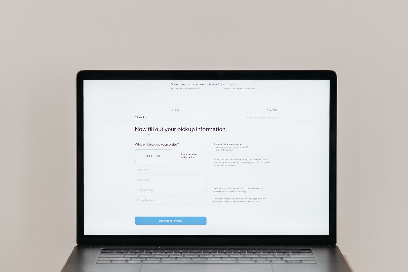
How to Test Contact Forms and Checkout Flows Before Launch
Test your contact form and checkout flow before launch with a step-by-step check that catches silent failures before they cost you enquiries and sales.
-
How to Preview Your Site in Different Browsers You Don’t Have Installed
You can check your site in Safari, Edge, and other browsers you don’t have installed using free screenshot and live-session tools — no second computer needed.