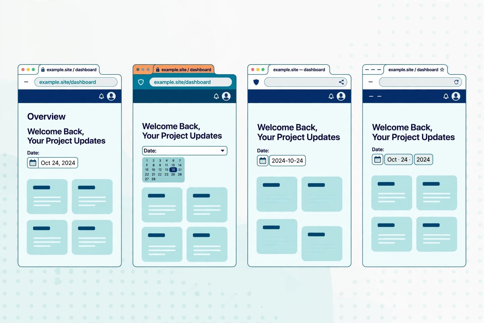
Cross browser testing means checking your website in Chrome, Firefox, Safari, and Edge to catch layout, styling, and feature differences before visitors do. Your site looks different everywhere because each browser uses its own rendering engine and adopts new features on its own schedule — but a handful of differences cause most breakage, and a short routine catches them.
I learned this the embarrassing way. A landing page I was proud of looked perfect in Chrome. Then a client opened it in Safari and sent a screenshot: the hero headline wrapped onto three lines, the sticky navigation overlapped the content below it, and a date field showed a completely different picker. Nothing was “broken.” The page simply met four different browsers — and each one read it slightly differently.
Why does the same website look different in every browser?
Because browsers are not the same program wearing different skins. Chrome and Edge run on Blink, Firefox on Gecko, Safari on WebKit. Each engine interprets the same HTML and CSS through its own code, and each ships its own default stylesheet — built-in margins, font sizes, and form-control styles applied before your CSS loads.
That alone explains small shifts: a button a few pixels taller here, a heading a touch larger there. Bigger differences come from timing. A CSS feature may land in Chrome months before Safari supports it, and every browser on iOS is WebKit underneath, whatever its name badge says. So “works in Chrome” never proves “works everywhere.”
Add user settings — different default font sizes, dark mode, zoom levels, ad blockers stripping scripts — and identical pixels in every browser starts to look like the fantasy it is. Cross browser testing is not about pixel perfection. It is about making sure nothing important breaks anywhere real visitors browse.
What are the most common cross-browser differences?
In practice, five categories cover most of what you will find:
Layout and spacing. Flexbox and grid behave consistently these days, but gaps, wrapping, and percentage rounding still diverge at the edges. The classic symptom is a card row that fits in Chrome but wraps a card onto a new line in Safari, or a sticky header that sticks in one browser and scrolls away in another.
Form controls. Buttons, dropdowns, date pickers, and checkboxes are the worst offenders, because browsers draw many of them with native operating-system controls. A date input renders as a tidy calendar popup in Chrome and as plain text with spinners in Firefox. Style them explicitly — padding, font, border, appearance — or accept that they will look native, and different, everywhere.
Fonts and text rendering. The same font renders slightly heavier on one platform and lighter on another, and fallback fonts have different widths. A headline that fits on one line in Chrome can wrap in Safari purely because of font metrics. Leave breathing room in headlines and buttons; never size a container to fit text exactly.
Newer CSS and JavaScript features. Features like `:has()` and container queries arrive browser by browser. If you use one without a fallback, older browsers do not show an error — they silently ignore the rule, and part of your layout quietly vanishes. Check support first, and write the fallback first.
Scrolling and viewport quirks. Mobile Safari’s collapsing address bar changes the visible viewport height as you scroll, which is why a hero sized to exactly 100vh can look cut off on iPhones. Using the newer `dvh` unit with a `vh` fallback handles this cleanly.
How do you run cross browser testing without installing everything?
You do not need four computers. A practical routine uses what you already have, plus one free cloud option:
1. Start with your own browser and one rival. Build in Chrome, then check the same pages in Firefox. Those two engines catch most layout and scripting issues.
2. Borrow Safari without buying a Mac. Use a free tier of a cloud browser service — BrowserStack, LambdaTest, and Sauce Labs all offer limited free sessions — and open your key pages in real Safari. For iPhone rendering, nothing substitutes for real WebKit.
3. Do not forget Edge. It shares Chrome’s engine, so it rarely surprises you, but corporate visitors disproportionately use it, and its tracking-prevention defaults occasionally block a script Chrome allows.
4. Test the same five pages everywhere: homepage, your most-visited page, a page with a form, a checkout or signup flow, and your most complex layout. Testing every page is a fantasy; testing the pages that carry your traffic is a routine you will keep.
Screenshot tools are useful for spotting visual drift across many combinations at once. But open the Safari and Firefox versions yourself and click through them — screenshots never notice that a dropdown cannot be closed with a keyboard, or that a button is visible but unclickable because an invisible element sits on top of it.
A real mini-test: one page, four browsers, three fixes
For this guide, I ran a simple test page — a hero, a three-card grid, a signup form with a date field, and a sticky navigation bar — through Chrome, Firefox, Safari, and Edge. Checking it properly took about twenty minutes, and the haul was typical:
First, the card grid wrapped in Safari but not in Chrome: a gap combined with percentage widths rounded up just past 100% in WebKit. Switching to fractional units fixed it in all four browsers at once.
Second, the date field looked like three different controls — expected, and harmless once I styled its padding and font consistently. Visitors do not compare your date picker across browsers; they compare it with the rest of your form.
Third, the sticky navigation overlapped the first heading in Safari only, because of a `position: sticky` interaction with an ancestor that had overflow set. Removing that wrapper fixed Safari without touching the other three.
Three fixes, none exotic, all invisible to a Chrome-only workflow. That is the normal yield of cross browser testing: not a rewrite, but a short list of small corrections that each protect a slice of your audience.
What should your cross browser testing checklist cover?
Keep it short enough to run before every launch:
– Layout: hero, navigation, and grid sections render without overlap or unexpected wrapping in Chrome, Firefox, and Safari.
– Forms: every field is usable — labels visible, inputs tappable, submit works — including date and dropdown controls.
– Interactive elements: menus open and close, and buttons respond to both mouse and keyboard.
– Media: images and video scale without overflow, especially at narrow widths.
– Fallbacks: any newer feature degrades gracefully in the oldest browser you support — content readable, layout intact.
Run it on the same five key pages, in the same order, every time. Consistency turns testing from a chore into a habit: when you always check Safari’s date field, you stop shipping surprises in it.
Layout across browsers is only half the story. A page can render identically in Chrome, Firefox, and Safari and still fall apart at phone widths. Once the browsers agree, check the same page at desktop, tablet, and mobile sizes with our responsive preview tool — cross-browser correct and responsive at every width is the combination that actually keeps visitors.
Frequently asked questions
How many browsers do I really need to test in? Chrome, Firefox, Safari, and Edge cover effectively all desktop traffic, and Safari on iOS covers the mobile case that behaves most differently. Testing those four catches the differences that matter; chasing browsers with under 1% share is rarely worth it for a small site.
Is cross browser testing still necessary now that browsers are more standard? Yes, but it is shorter than it used to be. Engines have converged, so you will find fewer catastrophic breaks — but form controls, Safari quirks, and new-feature timing still produce real differences. The routine shrank from days to under an hour; it did not disappear.
What is the difference between cross browser testing and responsive testing? Cross browser testing asks whether the same page works in different browsers; responsive testing asks whether it works at different screen sizes. A page can pass one and fail the other, which is why launches need both.