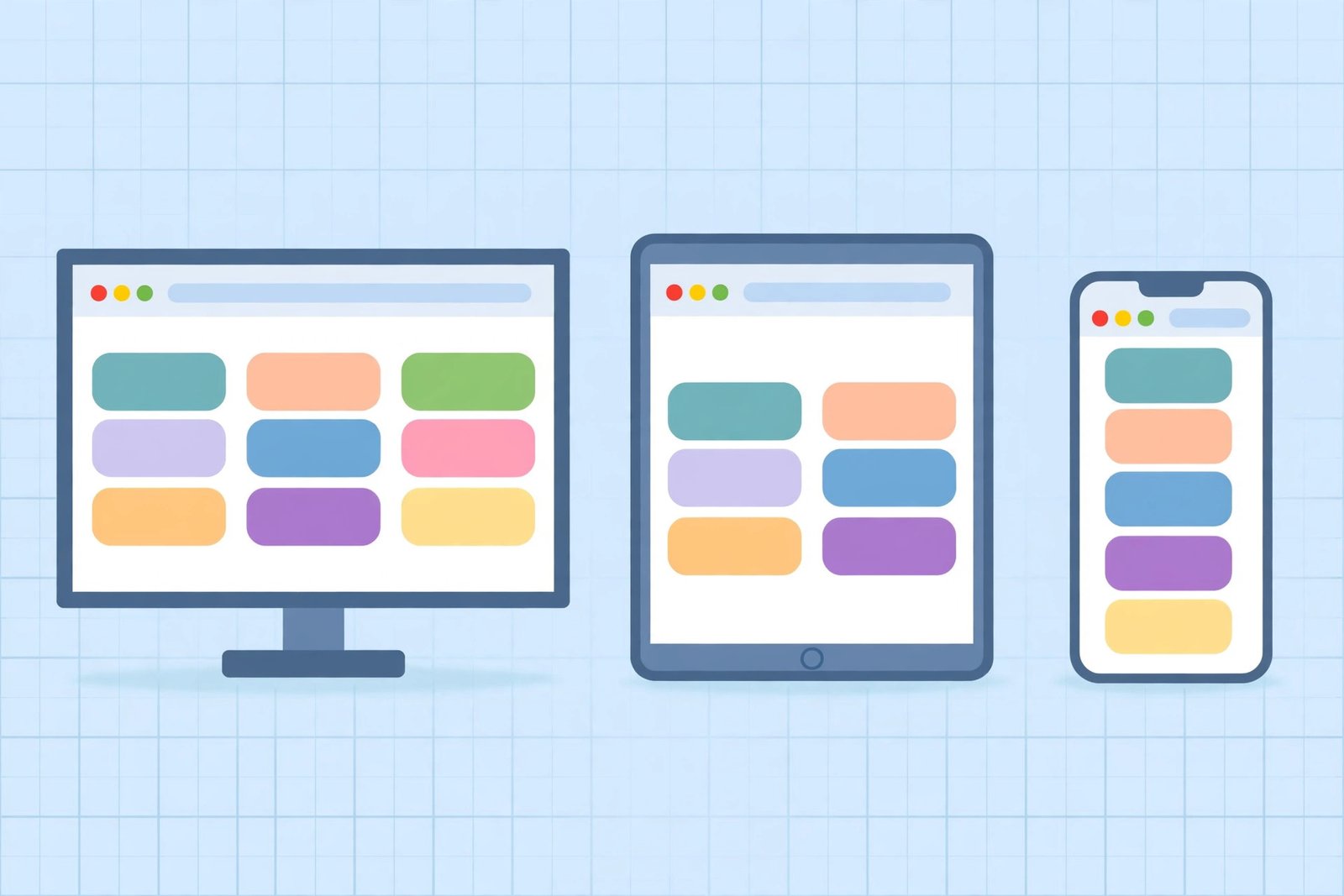
The best responsive design testing tools show you how your site renders at real phone, tablet, and desktop widths without owning a single physical device. Most are free browser features or no-signup websites that load your page side by side at widths like 375px, 768px, and 1280px. Below are the ten I actually reach for, with honest notes on what each one is good at and where it falls short.
I test every site I touch on multiple screen sizes before it ships. Not because I enjoy QA — because I’ve shipped too many layouts where the hero looked great on my monitor and the call-to-action was unreachable on a phone. A ten-minute pass through two or three of these responsive design testing tools would have caught every one of those bugs. Here’s my shortlist.
What are responsive design testing tools?
They’re utilities that render your web page inside simulated viewports — the exact pixel widths of popular phones, tablets, and desktops — so you can see layout, typography, and navigation behavior at each size. Some are built into your browser’s developer tools; others are websites where you paste a URL and get side-by-side previews; a few connect you to real devices in the cloud.
Which free responsive design testing tools are worth using?
Here’s my working set, grouped by what they’re actually for. All ten are free at the tier I’m describing.
1. Chrome DevTools device toolbar. The tool you’ll use most. Press Ctrl+Shift+M (Windows) or Cmd+Shift+M (Mac) with DevTools open, and your page re-renders in a phone-sized frame with real device presets — iPhone 14, Pixel 7, and dozens more. You can rotate, throttle to a slow 4G network, and even simulate touch. Best for: quick checks during development. Weakness: it’s still your desktop browser, so desktop-only quirks (hover menus, real touch scrolling) aren’t fully honest.
2. Firefox Responsive Design Mode. Same idea, different engine. Ctrl+Shift+M opens it in Firefox, and it’s worth using precisely because it’s not Chrome — rendering differences between the two catch bugs no single browser will show you. Best for: catching cross-browser quirks early.
3. Our responsive preview tool. I’ll admit the bias, but I built the workflow for it: paste a URL, and the page loads side by side at desktop (1280px), tablet (768px), and mobile (375px) widths in one view. No signup, no install. Try it on your own site and compare all three widths at once — it’s the fastest way I know to spot a breakpoint that only breaks one size. Best for: quick before/after comparisons when you change CSS.
4. Responsinator. The simplest online option — enter a URL, and it shows your site inside frames of real devices (iPhone, Android, iPad, Kindle) stacked on one page. The layout is a bit retro, but it answers “does my site work on these devices?” in about thirty seconds. Best for: a fast visual pass with zero setup.
5. Screenfly. Enter your URL, pick from a long list of devices and screen sizes, and it loads your page in a matching frame. It also supports TVs and netbooks, which most tools skip. Best for: testing unusual screen sizes you forgot existed.
6. BrowserStack Responsive (free tier). The only free way to see your site on real devices in the cloud — actual phones and tablets, not emulators. The free tier is limited in minutes, so save it for the final pre-launch check rather than daily use. Best for: the confidence pass before something important goes live.
7. Google’s Mobile-Friendly Test. Dead simple: enter a URL, and Google tells you whether your page passes its mobile-usability criteria — tap targets, viewport setup, readable font sizes. If Google’s own tool flags you, fix it before anything else, because Google’s crawler is reading the same mobile version your visitors see. Best for: catching the mobile bugs that hurt your rankings.
8. Window Resizer (Chrome extension). A tiny extension that resizes your browser window to exact preset dimensions — 360×640, 768×1024, 1366×768 — with one click. Cruder than a real emulator (it doesn’t fake touch or device pixels), but perfect for watching breakpoints snap as you drag through widths. Best for: developing and fine-tuning breakpoints in real time.
9. ami.responsivedesign.is. Type a URL and it renders your page inside a desktop monitor, laptop, tablet, and phone shown together in one stylish mockup. It’s the tool I use for screenshots in client presentations — the multi-device mockup makes responsive work look impressive without extra effort. Best for: sharing a “look, it works everywhere” visual with stakeholders.
10. PageSpeed Insights device view. People know PageSpeed Insights as a speed tool, but it also renders your page in mobile and desktop forms and flags layout problems — content wider than the screen, text too small to read, tap targets too close together — with a severity score for each. Running it on both tabs is the fastest free audit I know. Best for: one tool that checks speed and responsive layout at once.
How should you combine these tools for a real workflow?
Don’t use all ten on every page — that’s the road to busywork. Use three passes:
- During development: Chrome DevTools (tool 1) or Firefox (tool 2) with Window Resizer (tool 8) while you’re writing CSS.
- During review: a side-by-side online tool — our preview tool (tool 3) or Responsinator (tool 4) — to compare widths on a full page at once.
- Before launch: Google’s Mobile-Friendly Test (tool 7), PageSpeed Insights (tool 10), and if the page matters, a few minutes on BrowserStack’s real devices (tool 6).
That’s maybe fifteen minutes total for a page, and it catches the vast majority of responsive bugs.
What’s a real example of these tools catching a bug?
Last week I ran previewyoursite.online’s own homepage through tools 3, 7, and 10 in sequence. The side-by-side preview showed the nav menu collapsing cleanly at 375px — good. But PageSpeed Insights flagged one thing the emulators didn’t: a “content wider than screen” warning caused by an embedded tool frame with a fixed minimum width of 420px. On phones, the page could be swiped sideways — a classic horizontal-scroll bug. Fix: one CSS line, max-width: 100% on the frame. The emulator pass said “looks fine”; the automated audit found the real bug. That’s why the review pass and the audit pass both matter.
Frequently asked questions
What are the best free responsive design testing tools?
For daily use: your browser’s device toolbar (Chrome or Firefox, Ctrl+Shift+M) and a no-signup online tool that renders your URL at phone, tablet, and desktop widths side by side. For pre-launch confidence: Google’s Mobile-Friendly Test, PageSpeed Insights, and BrowserStack’s free real-device tier.
Do I need a real device to test responsive design?
Not for the first 90%. Emulators and online tools catch layout, typography, overflow, and breakpoint bugs reliably. Use a real device (or BrowserStack’s cloud devices) for the final check before an important launch — touch feel, scroll physics, and real network behavior.
What screen widths should I test?
At minimum: 375px (the most common phone viewport), 768px (tablet), and 1280px or 1440px (desktop). If your analytics show other widths matter for your audience, add those.
Is resizing my browser window enough to test responsiveness?
It’s a decent first pass, but it keeps desktop behaviors — hover states, desktop touch handling, full-power network — that lie to you about the mobile experience. Use at least one real emulator or side-by-side tool before you call a page “tested.”