Tablet Preview Website Guide: The Screen Size Everyone Forgets to Test
Tablets sit between phones and laptops — and that in-between size is exactly where layouts quietly break. Here’s how to preview your site on tablet screens before visitors do.
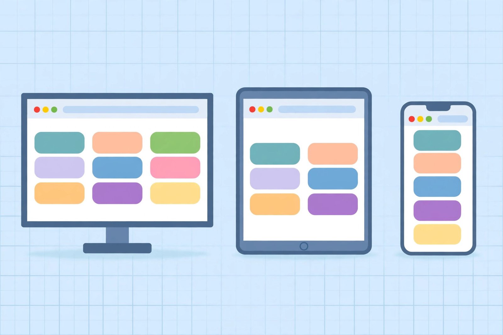
Ten free responsive design testing tools that show you exactly how your site renders on phones, tablets, and desktops — no device lab required.
Learn how to preview your website on mobile before publishing — free emulator methods, what to check at a 375px viewport, and the five-minute QA checklist that catches the bugs desktop previews miss.